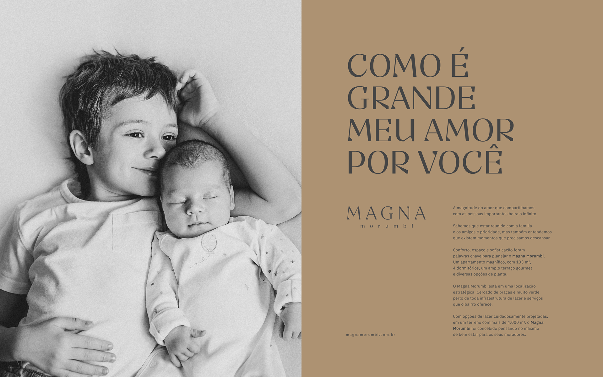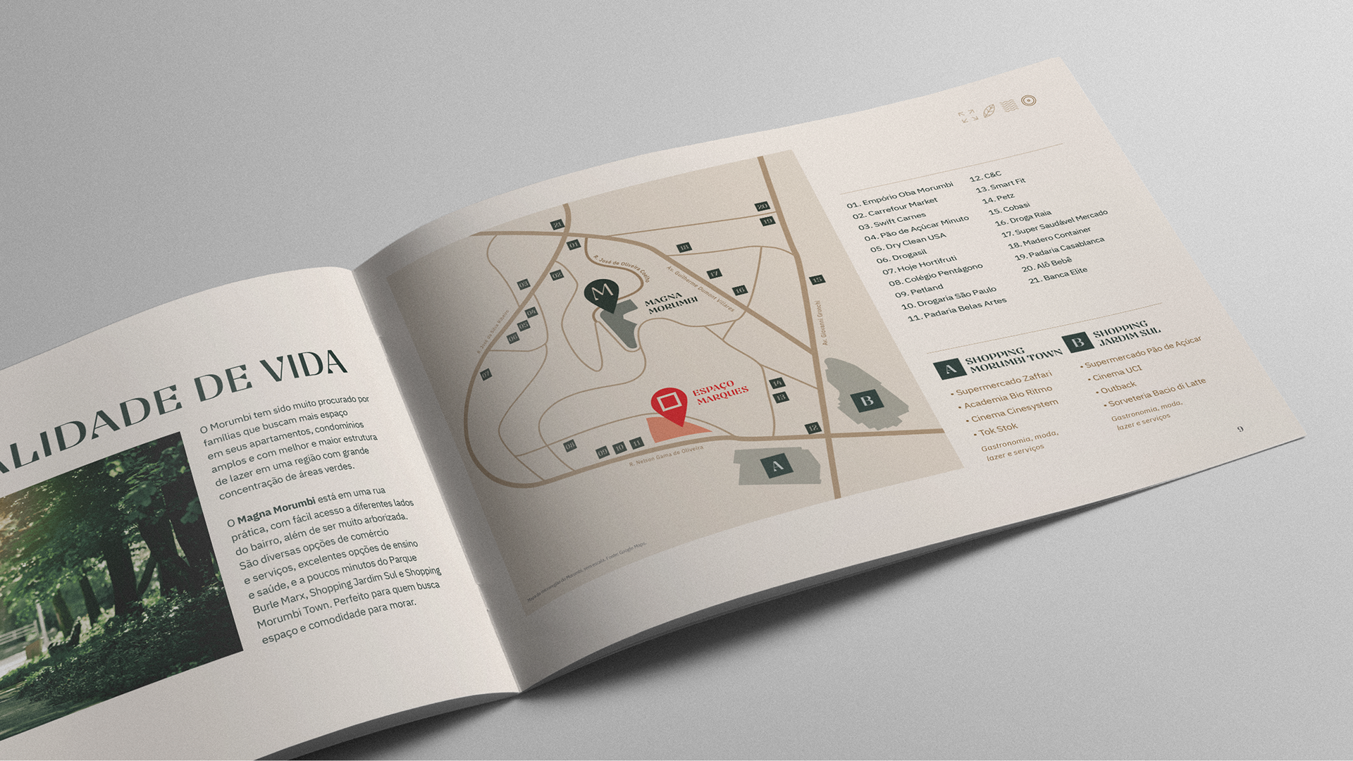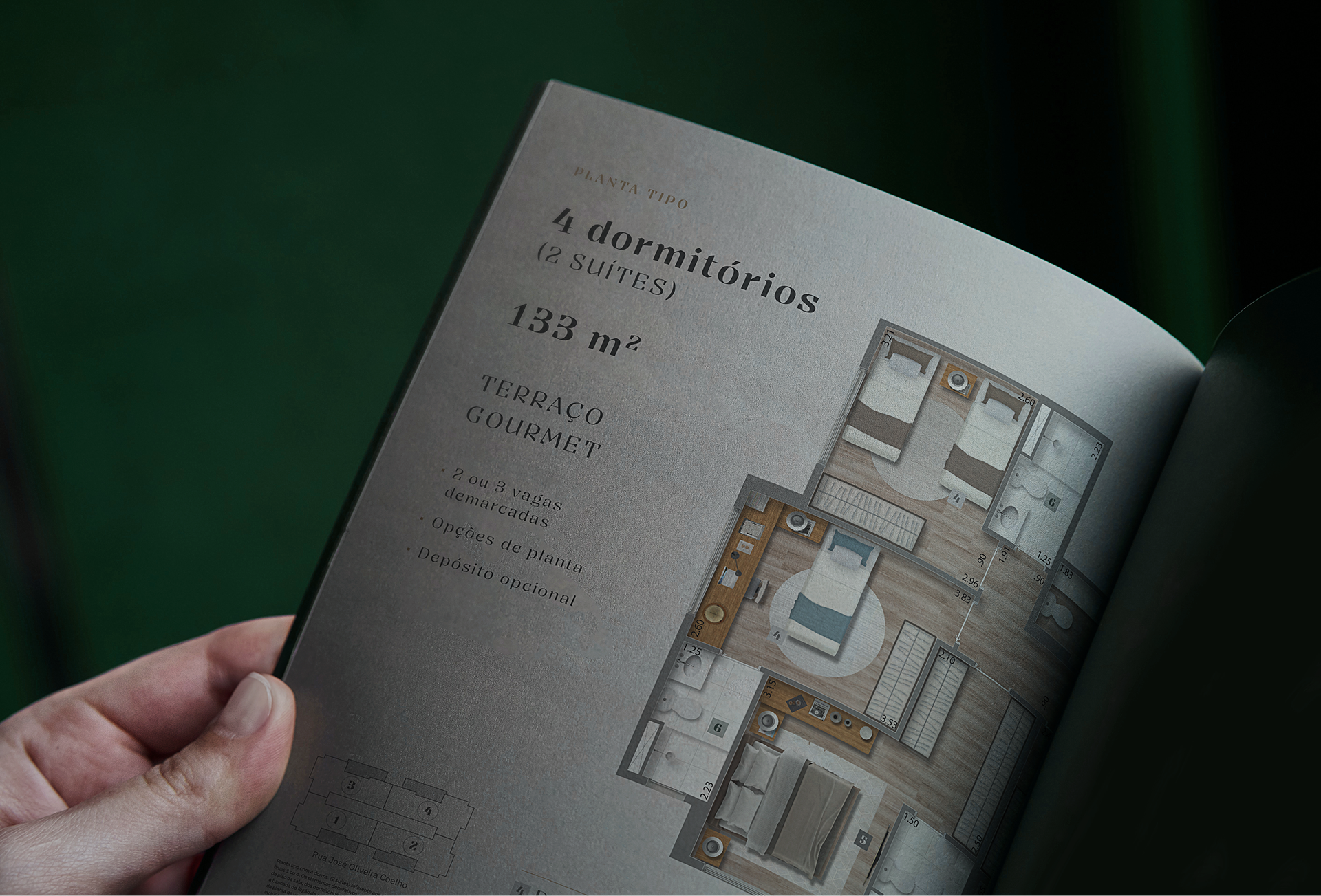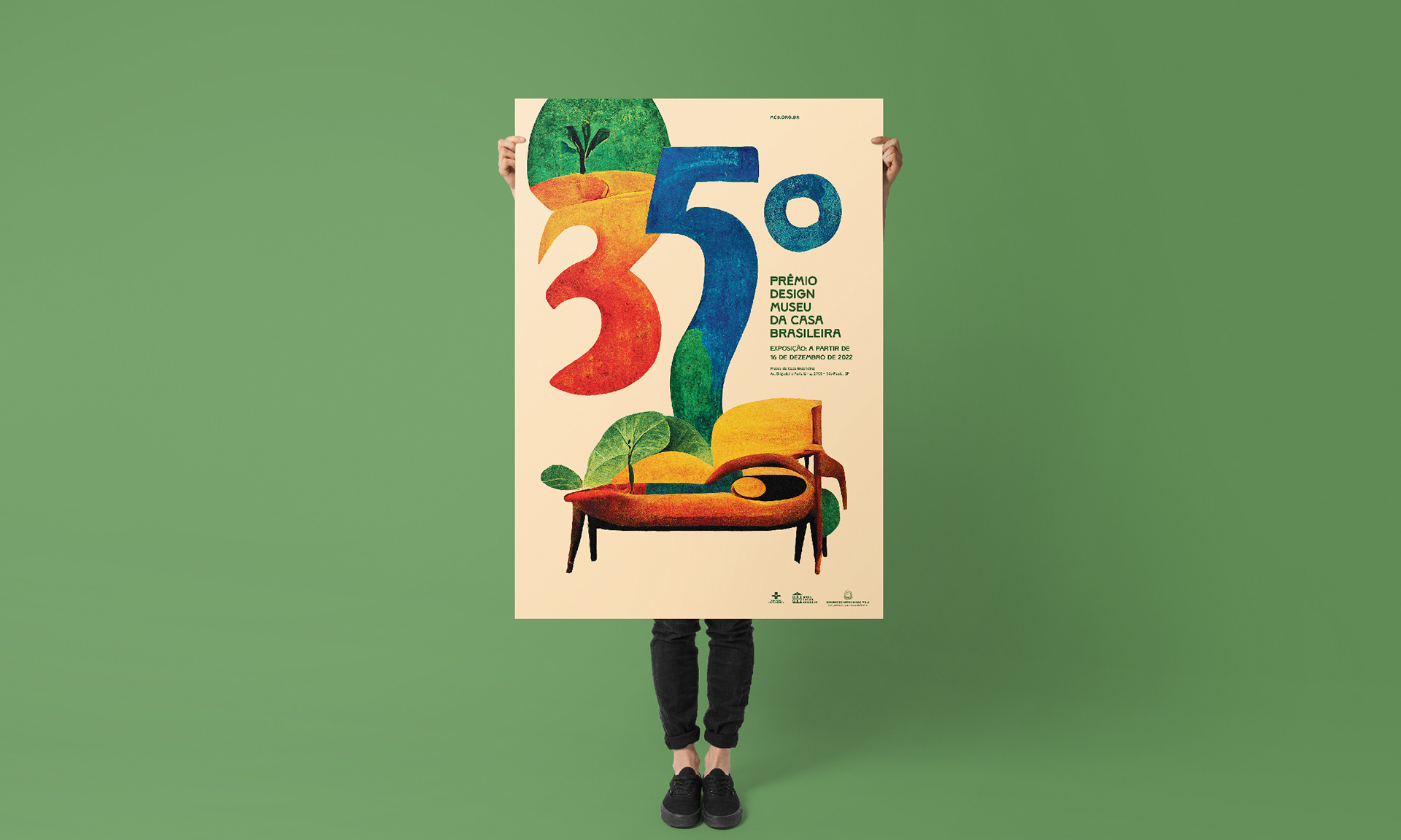
Magna Morumbi → With a 133 m2 apartment, full leisure facilities, Magna Morumbi stands out from other real estate in the neighbourhood. It's bigger, more sophisticated and well located.
Challenge → Create the name, brand strategy, visual identity and a full campaign that resonates with an different audience inside that area from the neighbourhood.
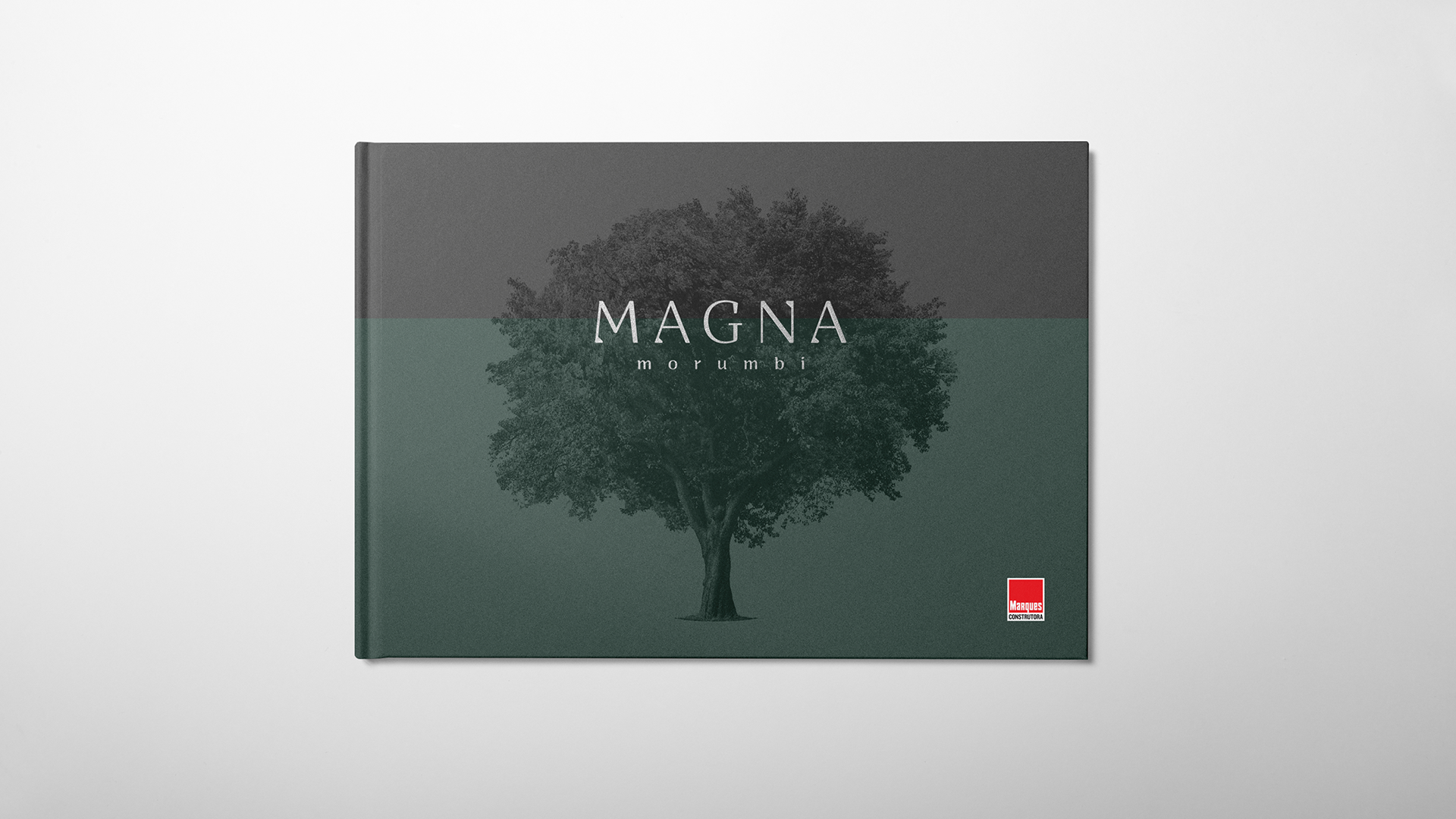
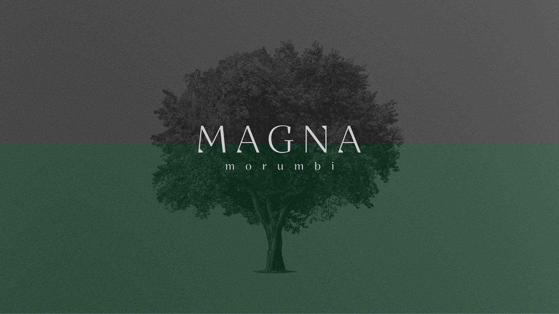
Concept → Magnitude
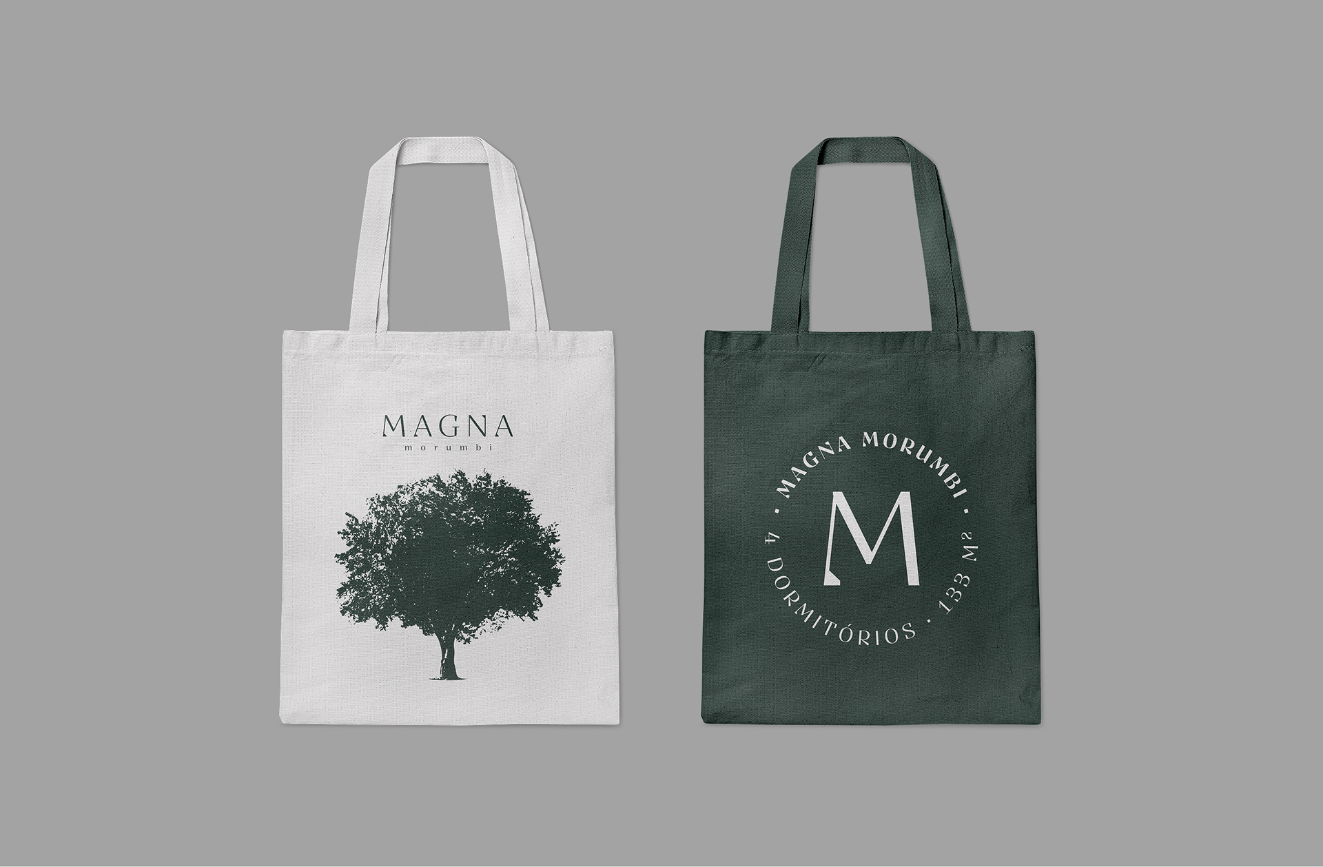
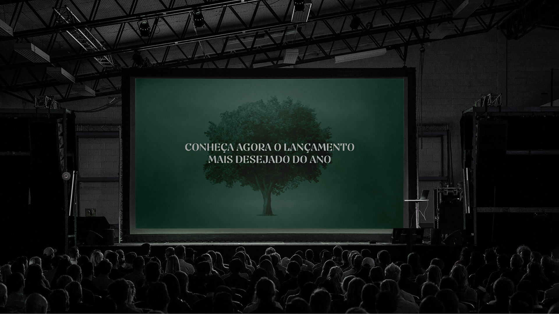
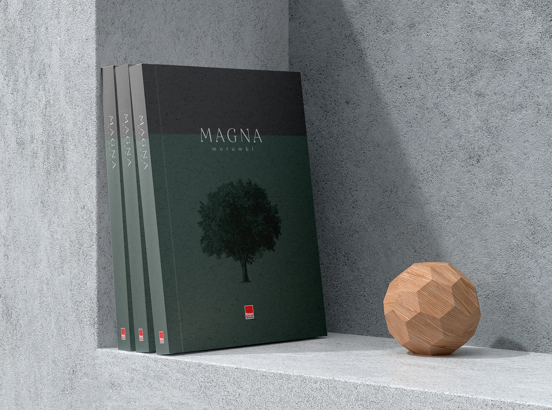
Idea → The idea behind the name, brand and the whole campaing is magnitude. Reflecting the apartments generous size and extending this concept to the magnitude of our love for our family, friends and our moments of joy, we created a campaing with sober colors, emotional black and white photography, and touching copywriting, to make the right connection to the potencial clients. The chosen symbol is the Tree of Life, associated with familial bonds, growth, strenght and knowledge. It represents the interconnectedness of generations and the continuity of family lineage.
Challenge → Create the name, brand strategy, visual identity and a full campaign that resonates with an different audience inside that area from the neighbourhood.
Concept → Magnitude
Idea → The idea behind the name, brand and the whole campaing is magnitude. Reflecting the apartments generous size and extending this concept to the magnitude of our love for our family, friends and our moments of joy, we created a campaing with sober colors, emotional black and white photography, and touching copywriting, to make the right connection to the potencial clients. The chosen symbol is the Tree of Life, associated with familial bonds, growth, strenght and knowledge. It represents the interconnectedness of generations and the continuity of family lineage.