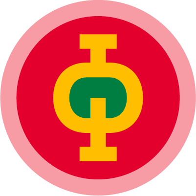
To promote tourism, in the The Peruaçu River Valley, Ekos Brasil Institute, which manages the Park in conjunction with ICMBio, asked for the creation of a brand / seal.
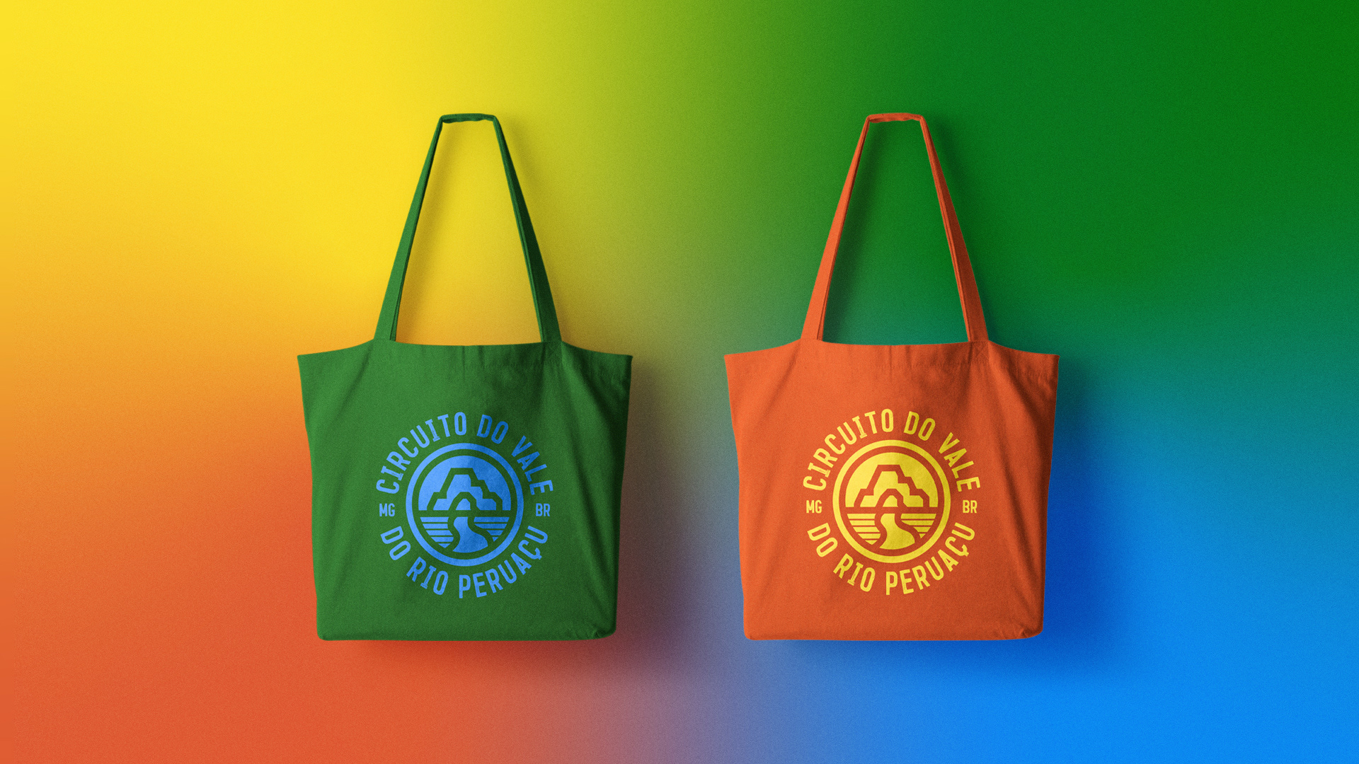
This brand will be used by the local tourism association itself, highlighting establishments and service providers with good evaluation, compared to the seal of recommendations such as TripAdvisor and other applications.
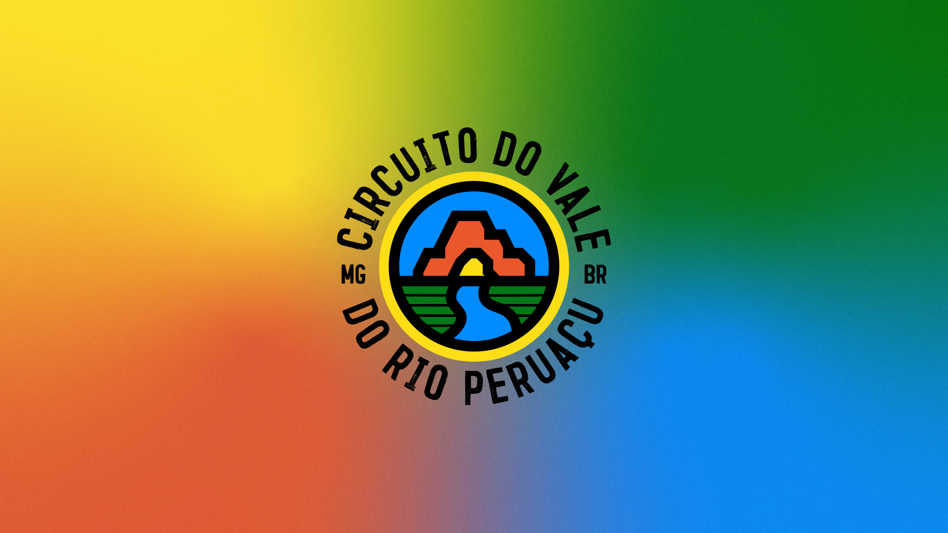
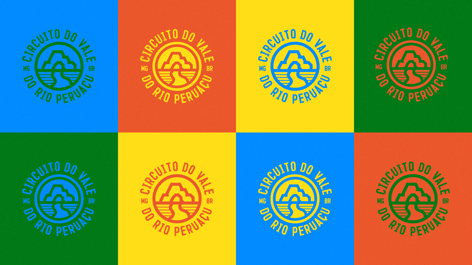
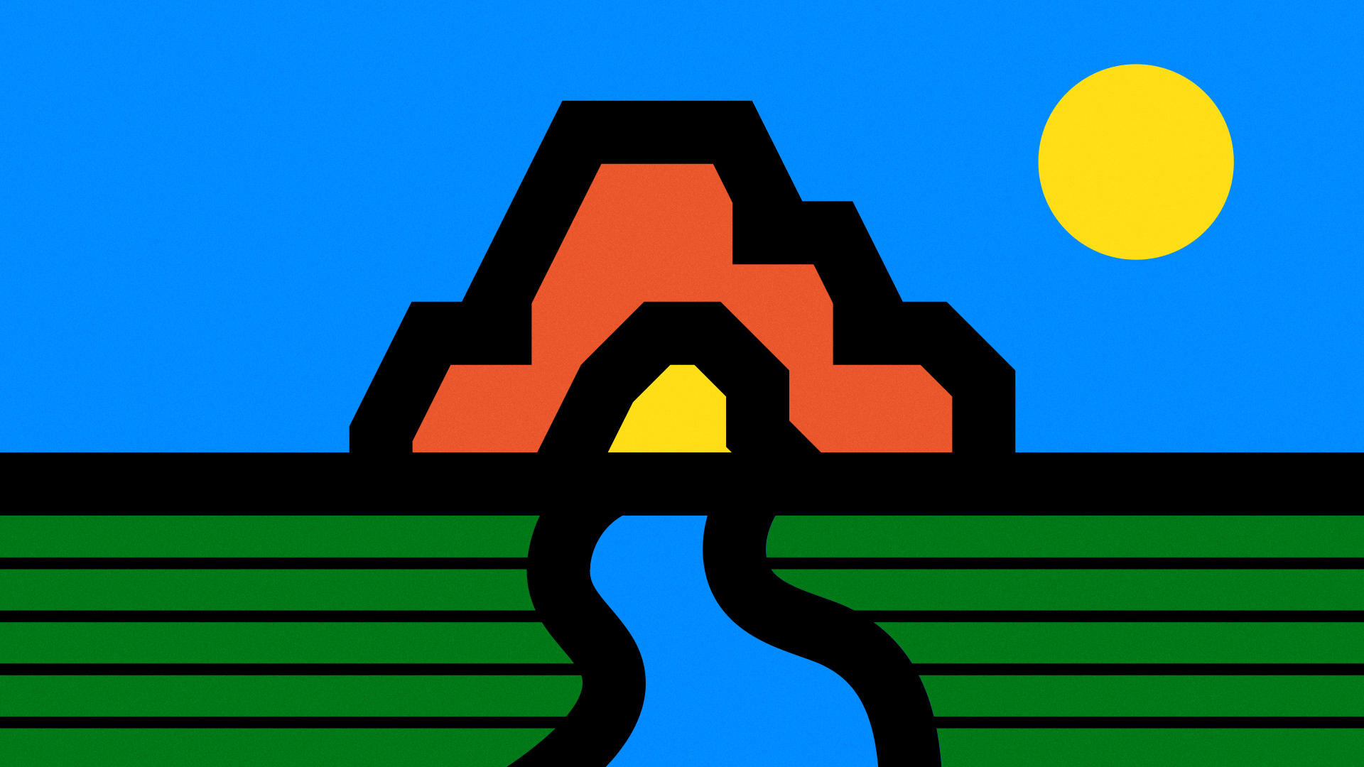
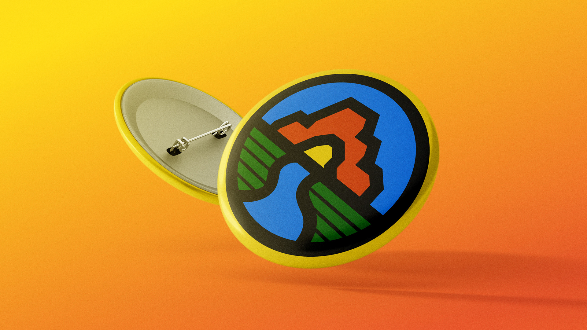
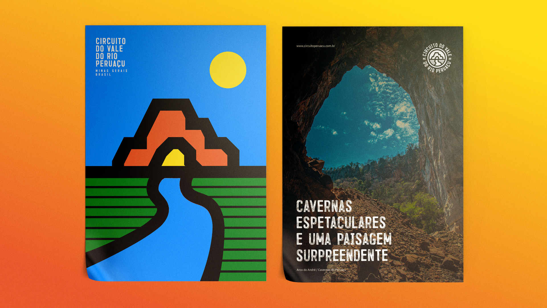
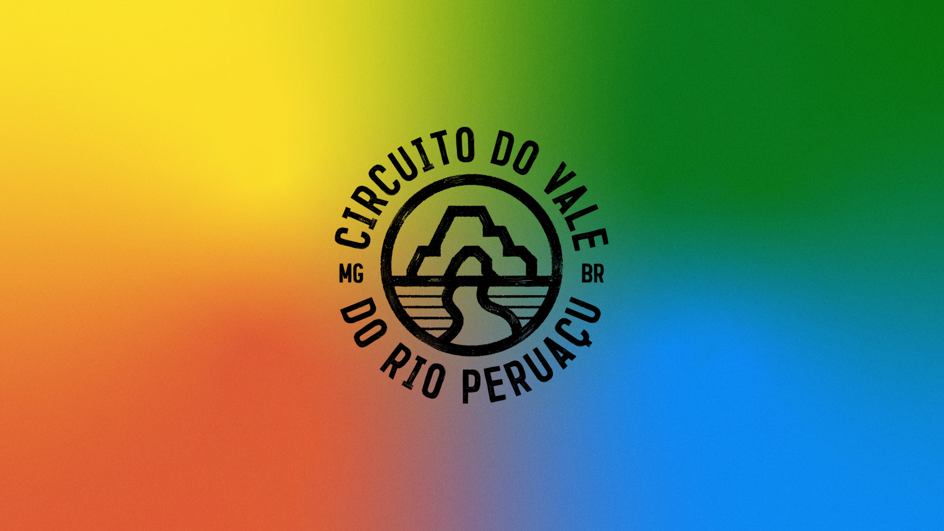
The brand was inspired by Boy Scouts Badges, based on the concept that in order to earn a badge, one must be a specialist in a certain skill, associating it with the explorer's archetype. The 4 basic elements and colors for the design were defined: the cave, the river and sky, the vegetation and the sunlight.
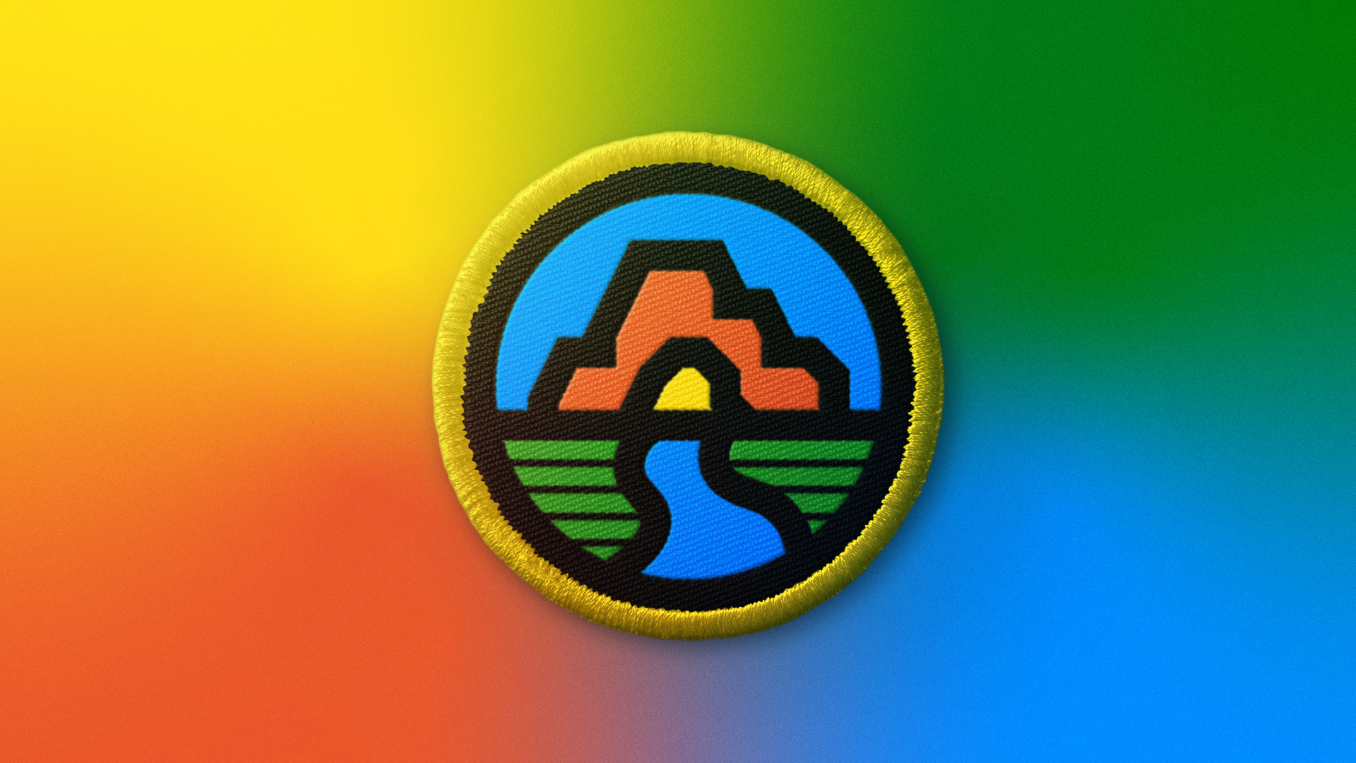
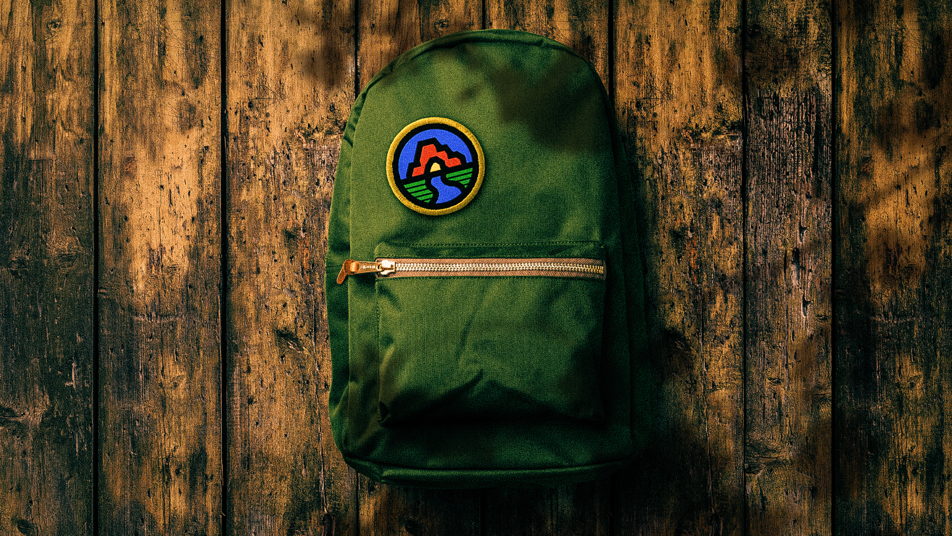
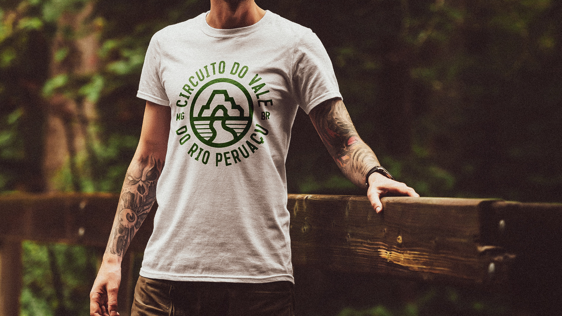
The composition was executed with thick lines, anticipating the use of the brand in one color, being cheaper to produce gifts and support materials. For the digital version adjustments were made to improve the visibility and legibility of the elements in social network avatars, mainly seen on the cell phone.
The colors were designed to quickly represent and associate the brand with nature, with two warm colors (yellow and orange) and two cool colors (blue and green). This way we can work with cheerful and contrasting layouts.
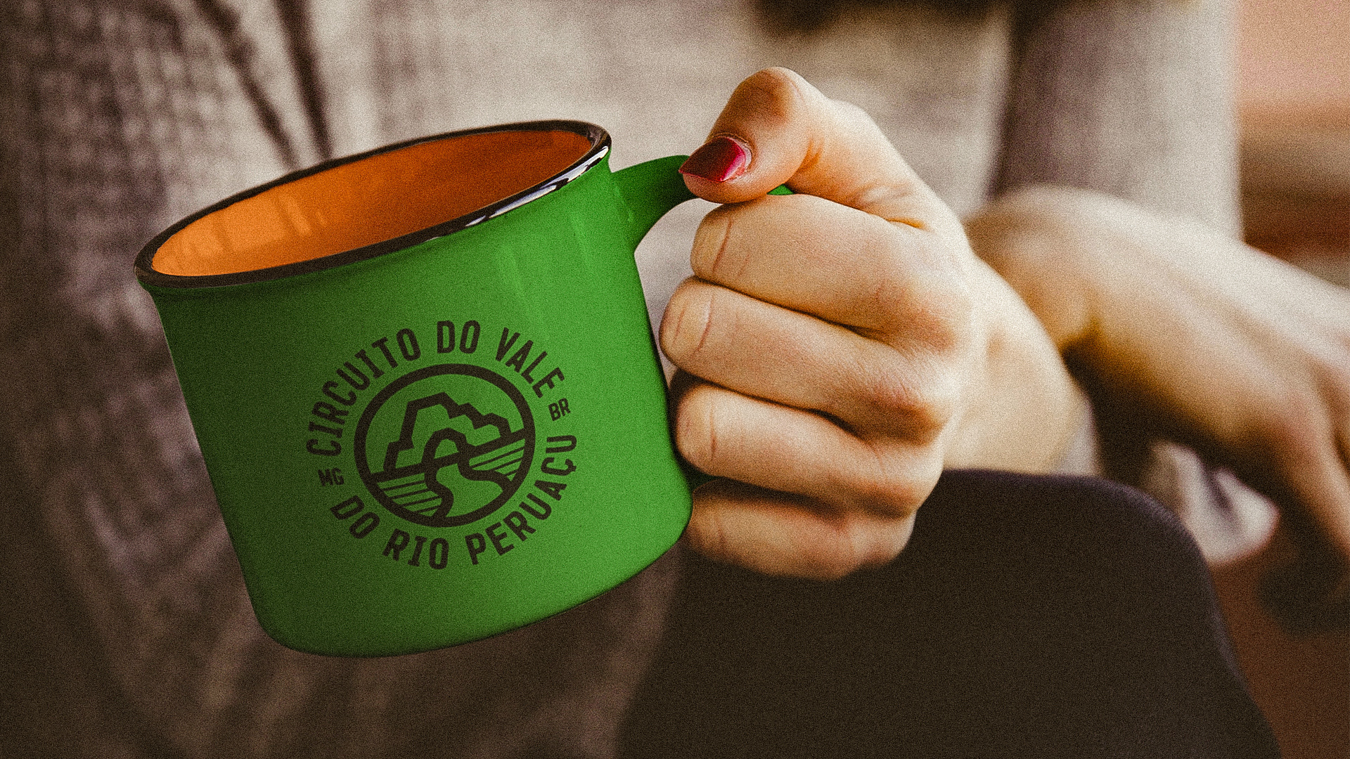
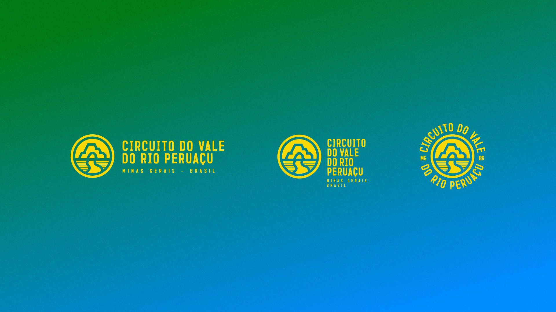
For the typography, a Brazilian font was used: Trincha, made by designer Vítor Bravin of Type Box - inspired by the rustic wall paintings that we see throughout Brazil, in grocery stores, walls and rustic signs. The secondary typography. IBM Plex Sans has similar features and works well in digital media, which will be used for dissemination.