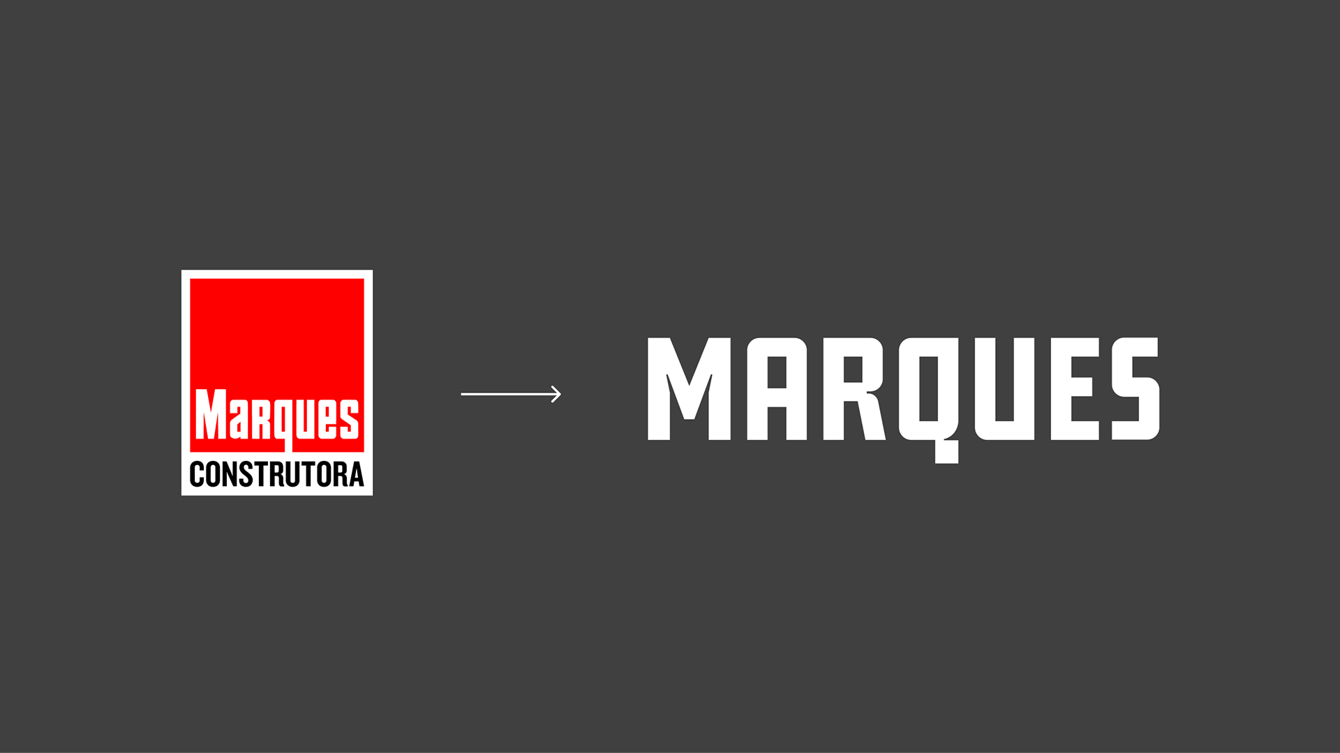

Marques Construtora → This project marked the second brand redesign for Marques Construtora (a construction company) in a 12-year relationship. The objective was to modernize the brand while preserving its equity, updating it for contemporary digital environments and new communication demands.
Challenge → Evolve the brand without breaking continuity. Increase legibility, functionality, and recognition across digital and physical touchpoints, while moving away from visual complexity accumulated over time.
Concept → Clarity, Modernity, Function
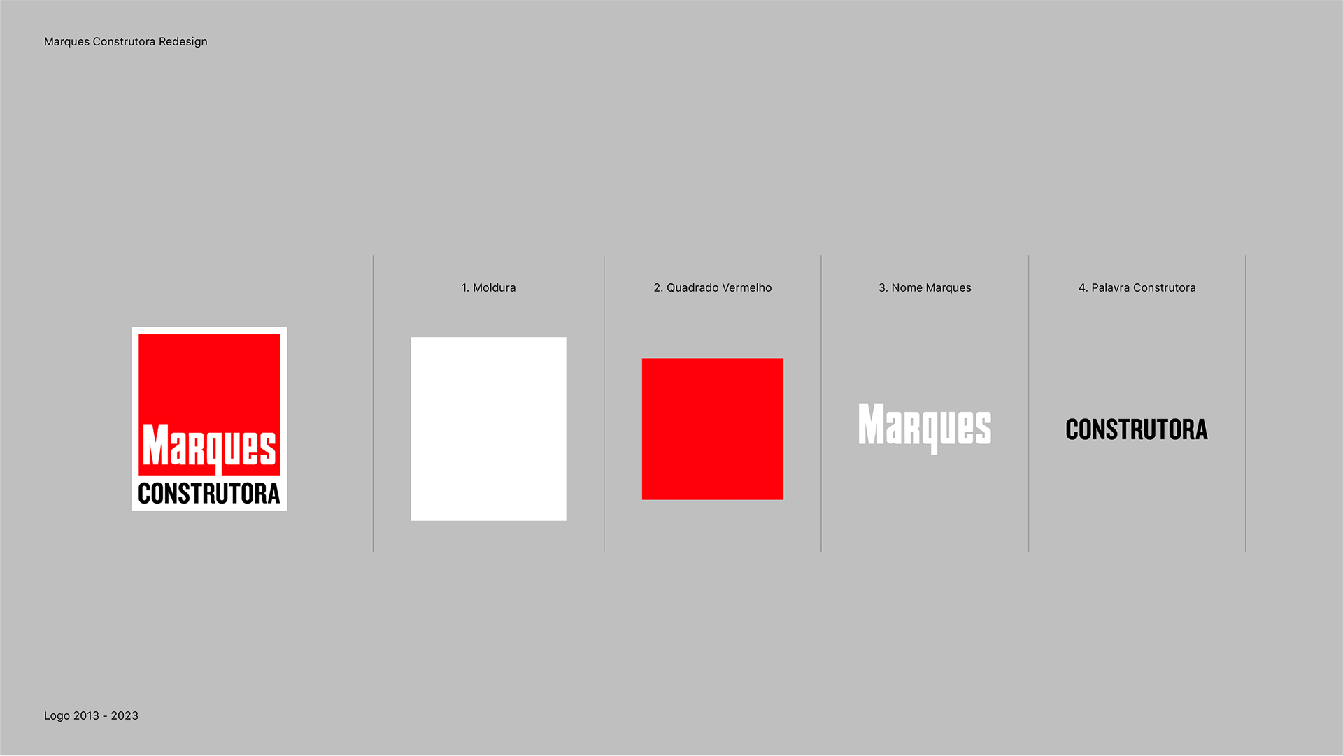
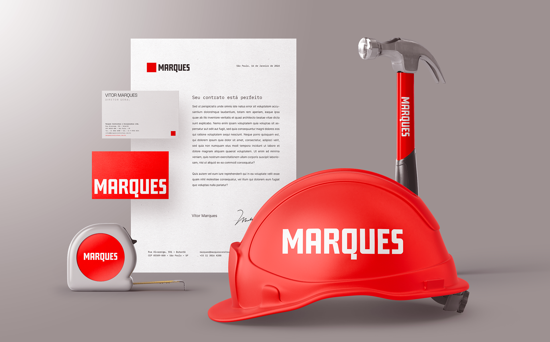
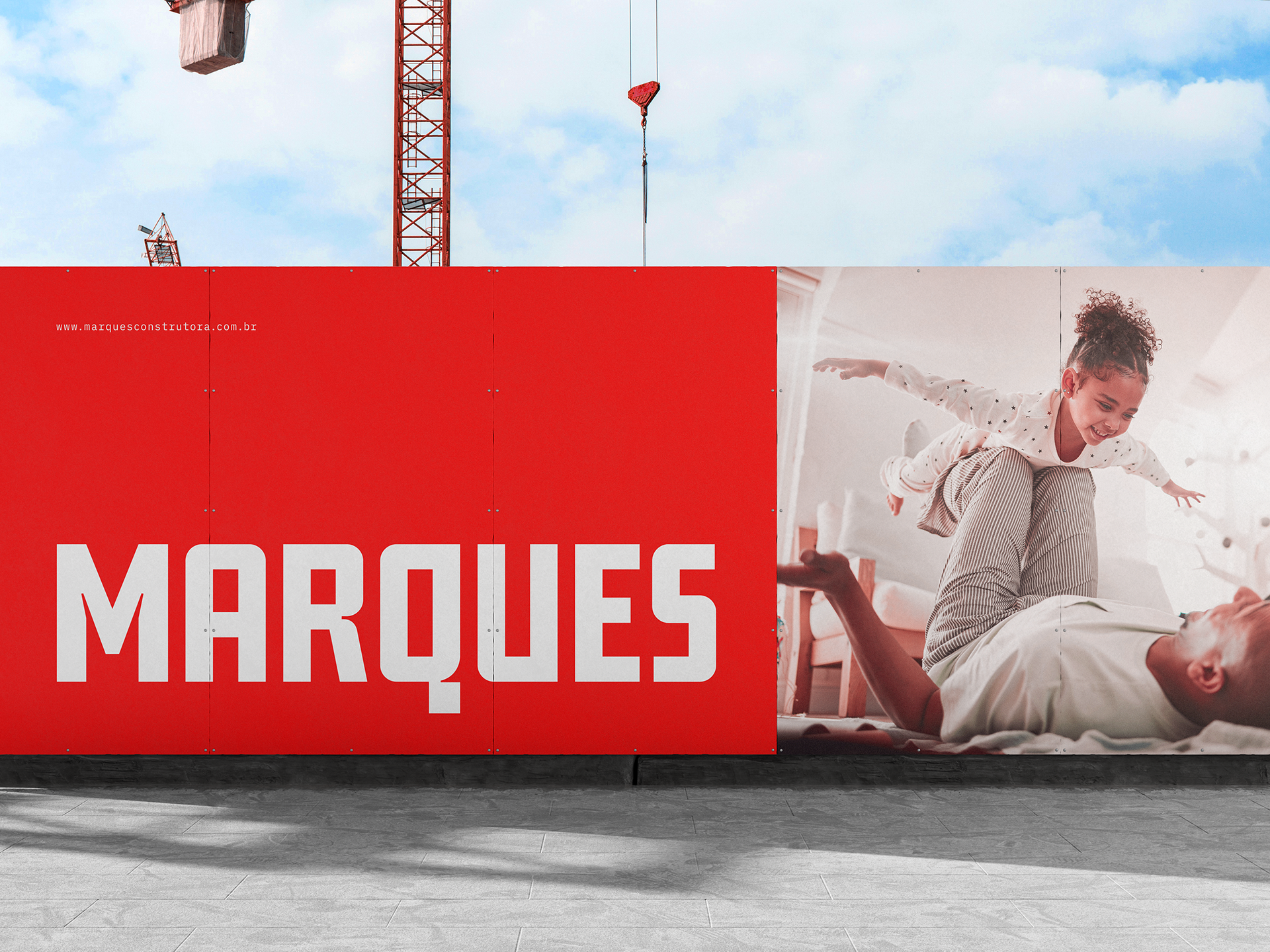
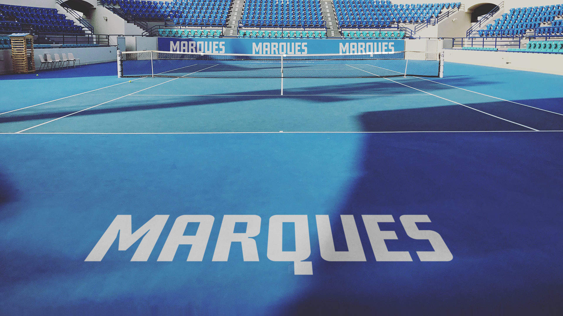
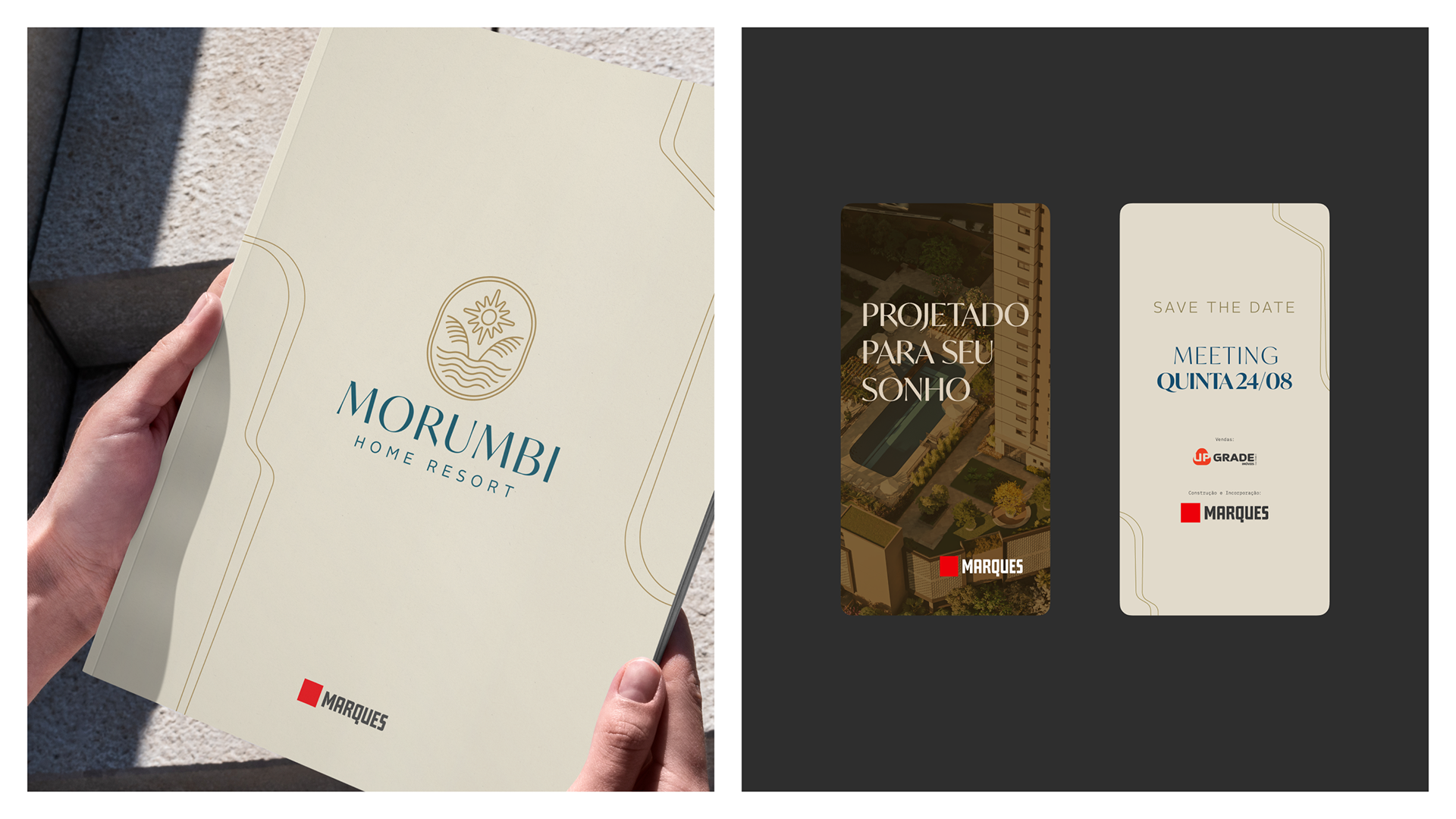
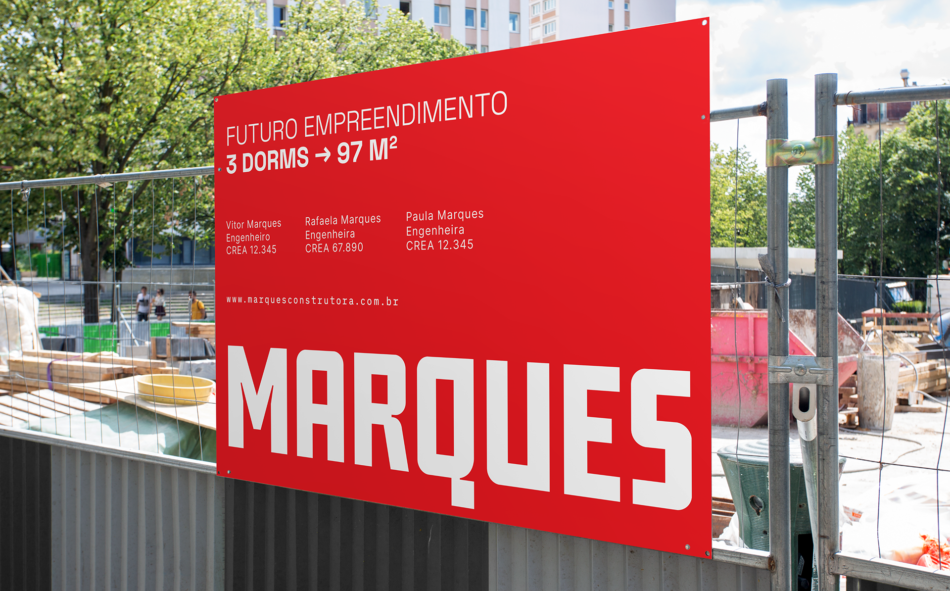
The Brand → The project began with an extensive visual and conceptual audit of the existing brand, its history, and its applications in market. From that analysis, I identified the need for a simpler, more direct system that could perform consistently across digital media while remaining distinctive.
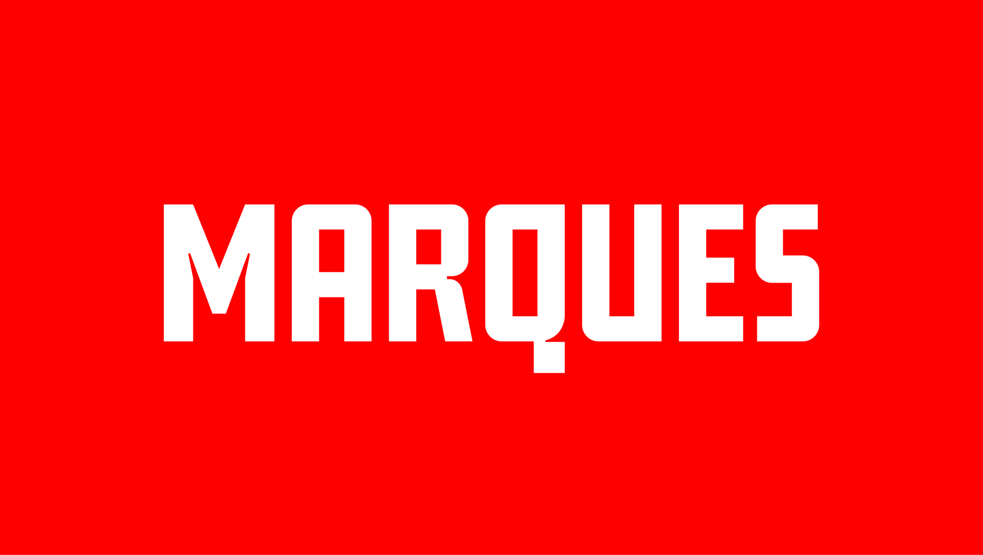
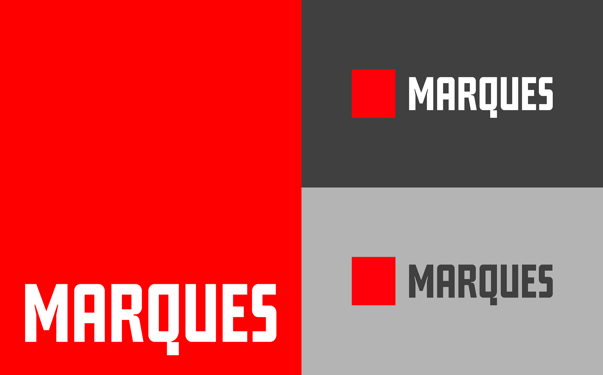
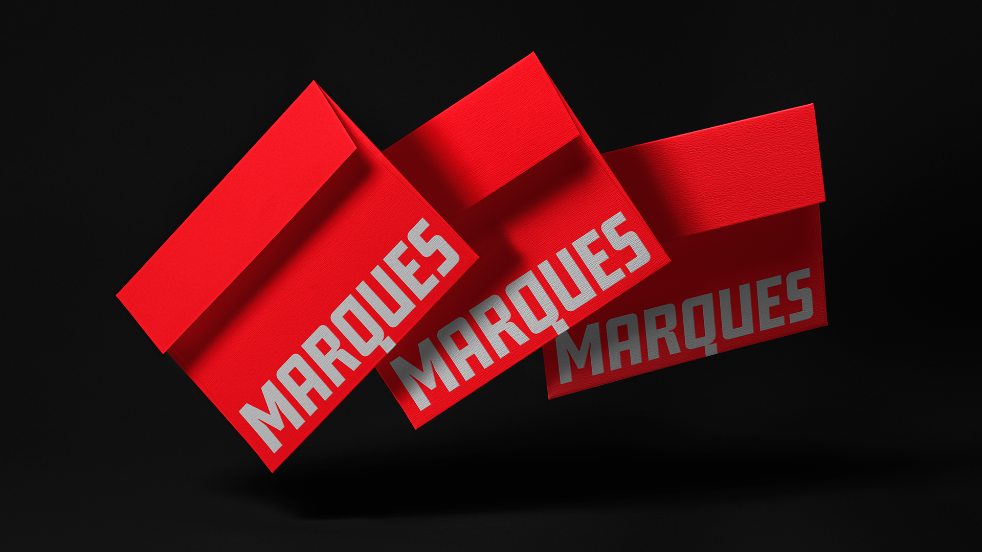
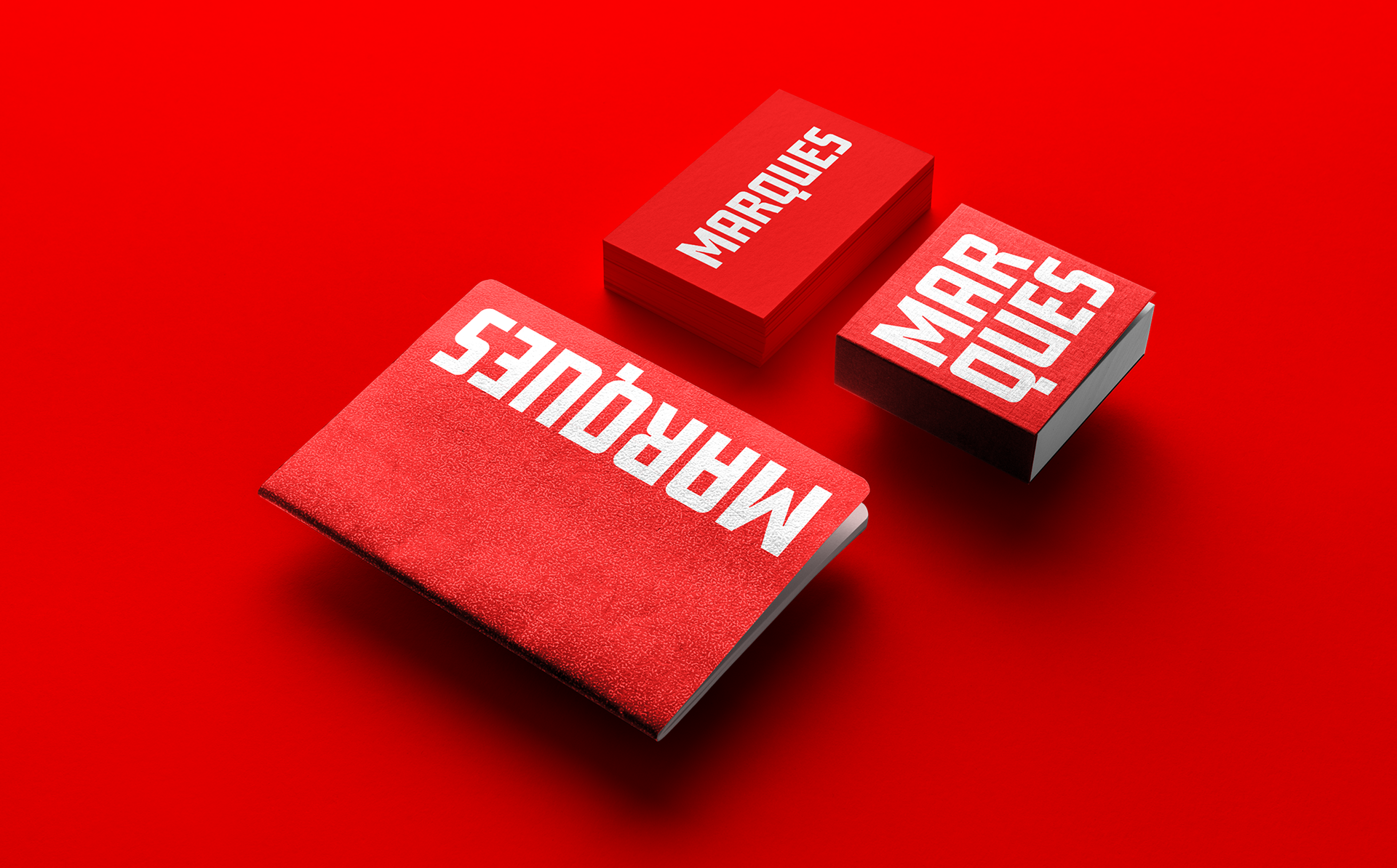
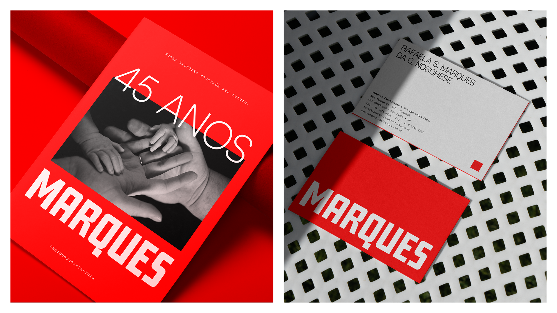
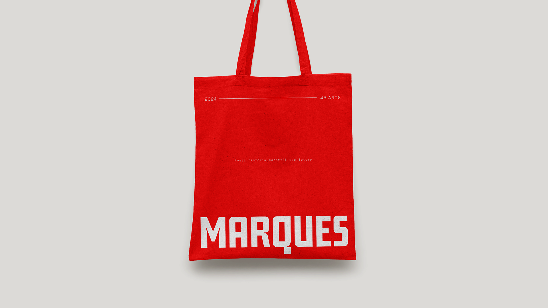
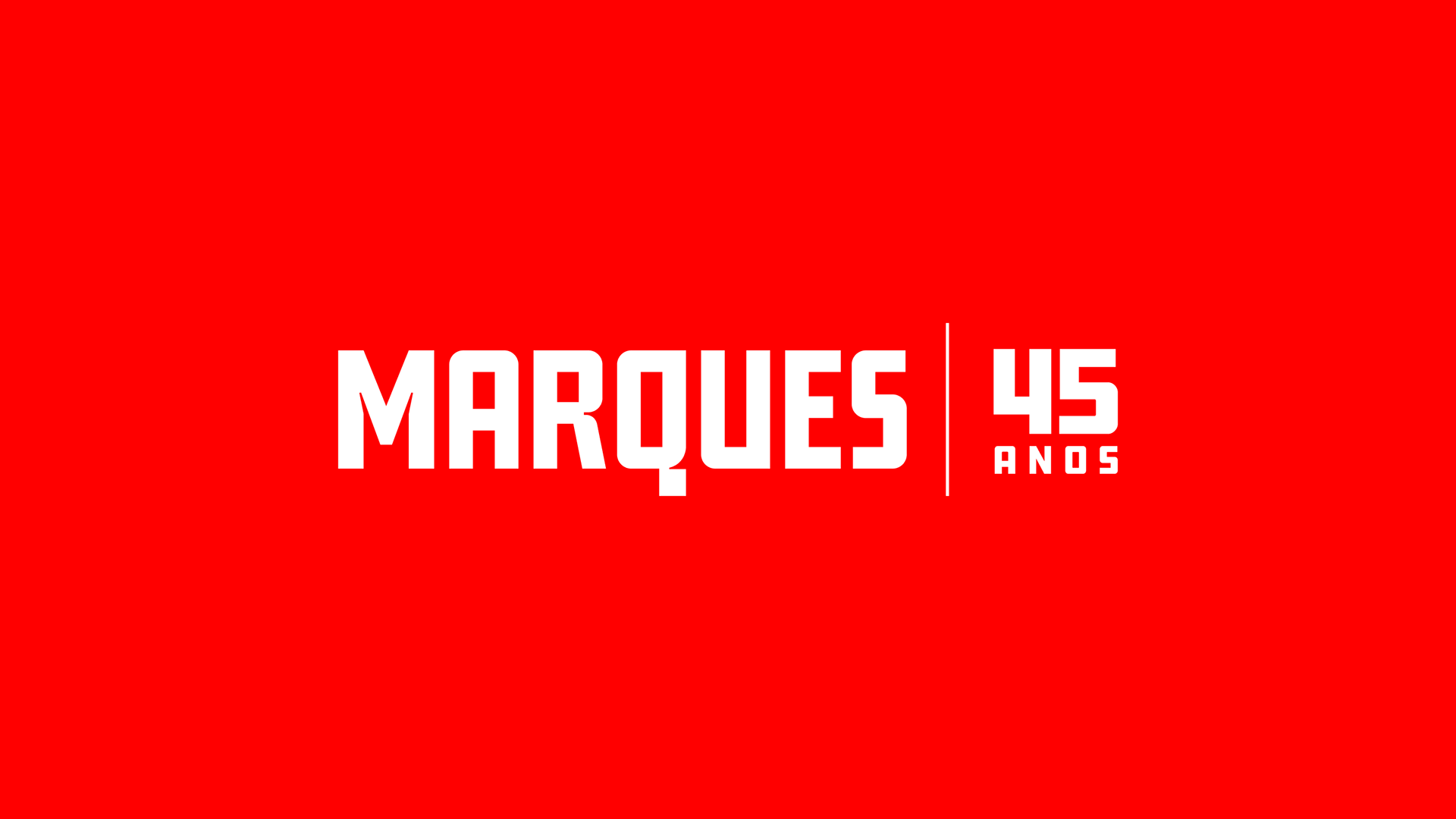
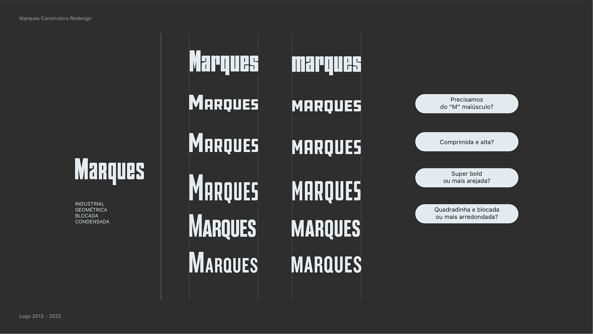
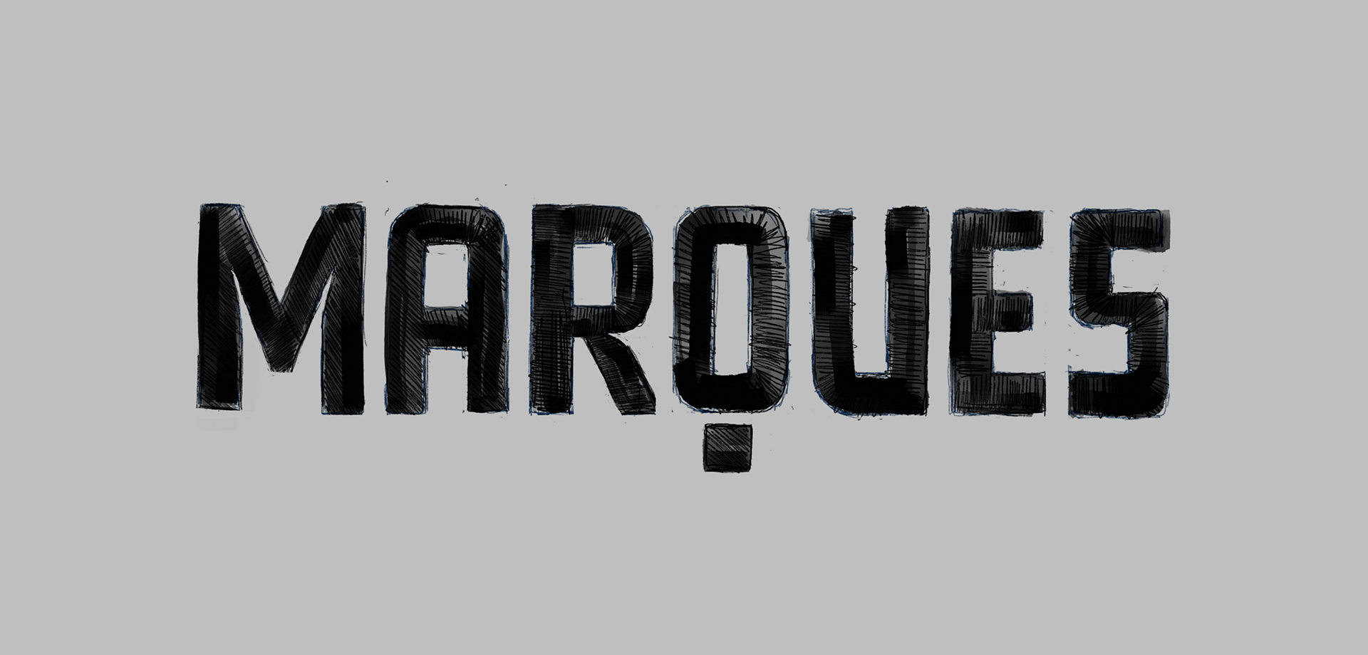
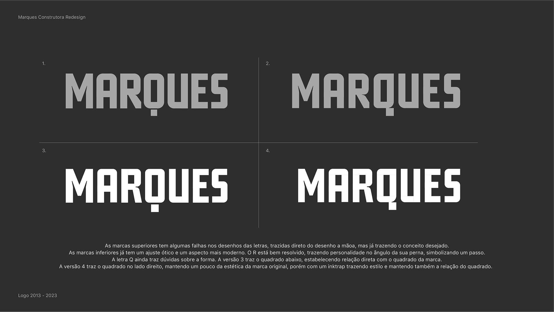
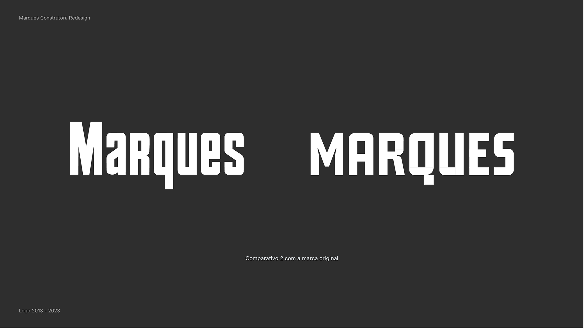
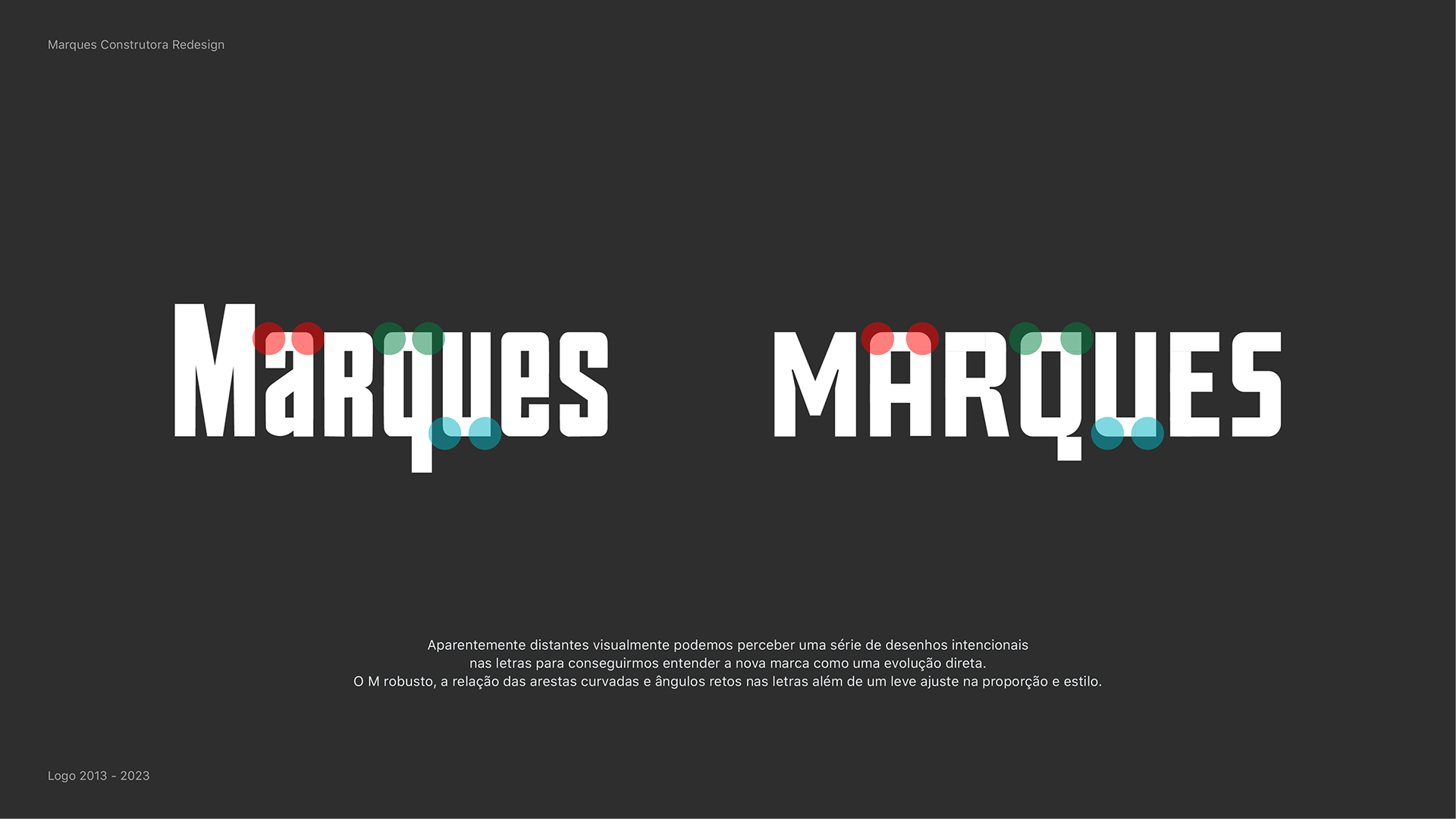
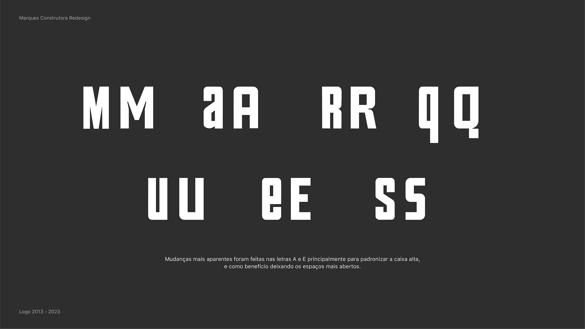
Typography became a central element of the redesign. The letterforms were drawn from scratch to achieve better legibility, balance, and control across scales — from large-format signage to small digital interfaces. The new typographic system brought cohesion and flexibility, allowing the brand to function more efficiently across different contexts.
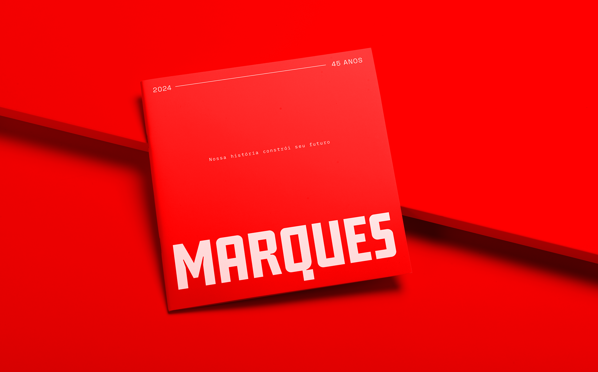
The resulting identity is cleaner, more modern, and easier to recognize, with a reduced visual language that prioritizes clarity and usability. The system was designed to be straightforward and scalable, supporting both current needs and future brand evolution without relying on decorative excess.